Late last week, there was a Bloomberg Business article on LendingClub’s recent “misfiring” of loan origination models. While I personally enjoy most of Bloomberg’s coverage of marketplace lending (positive or negative), this article appears to have taken a recent LC-Advisor report out of context.
Below are a couple actual data points on LendingClub’s underwriting performance:
1. Consistent performance on quarterly vintages

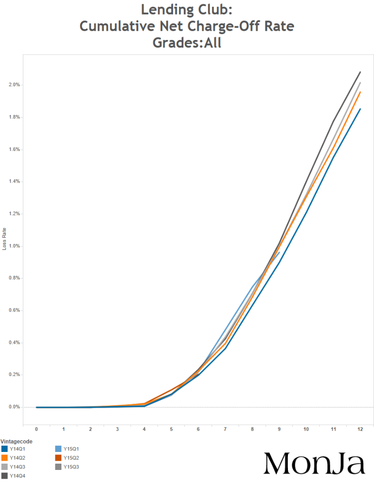
This graph is based on Lending Club’s loan level performance that shows loss rates of quarterly vintages. The Y-axis is the cumulative loss rate, and the X-axis indicates Month On Book. The lines are capped at 12 months for better visibility of early performance, with the shorter lines showing recent vintages with less than one year of payment history.
The mostly overlapping lines are an indication that the performance has been very consistent. If there is a material increase in losses, you would expect the more recent 2015 vintages (green, red, and dark purple lines) to be at a higher level than the other lines. Instead, the lines are right on top of each other, indicating that there has been no recent major shifts in performance to-date.
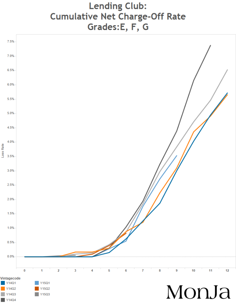
2. Improving performance on credit-sensitive segments

A better look at the higher yielding grades provides another context to the recent performance; these grades consist of loans made to more marginal borrowers (typically at a higher interest rate), and is expected to show stress even during a mild increase in overall delinquency rates. Following 2014 Q4, every vintage in this segment is trending to lower cumulative charge-off levels, indicating better performance over time.
Overall, while there are segments of weakness in Lending Club’s origination, this narrative of a problematic under-performance is a bit overblown. I love Bloomberg’s coverage of this sector in general – this is just a reminder that data-driven journalism can be tricky in a new field without a lot of common data standards.
